PayPal

PayPal

A product redesign exploring how PayPal can optimize its user mobile experience by reducing friction.

A product redesign exploring how PayPal can optimize its user mobile experience by reducing friction.

Role

Product Designer

Team

Solo

Timeline

2 weeks

Skills

User Research, Prototyping, Product Design

Problem

PayPal’s prioritization of feature and promotion discovery impedes its core functionality.

Goal

The goal of this project was to redesign Paypal to improve the user experience by identifying points of friction and competing features in the market. I also gave myself the constraint of adhering to PayPal's brand identity while conducting this redesign.

Research

User Interviews

I conducted 7 user interviews, 4 with current PayPal users and 3 with users of competing apps, in order to understand public perception towards PayPal and existing pain points.


Questions

Questions

Existing PayPal users

Existing PayPal users

1.

1.

Walk me through the last time you used PayPal, go through each step and your goal.

Walk me through the last time you used PayPal, go through each step and your goal.

2.

2.

Which PayPal features do you use regularly, and which ones do you ignore?

Which PayPal features do you use regularly, and which ones do you ignore?

3.

3.

If you could add or change one thing about PayPal, what would it be?

If you could add or change one thing about PayPal, what would it be?

Competing App users

Competing App users

4.

4.

What app do you currently use for payments, and what made you choose it?

What app do you currently use for payments, and what made you choose it?

5.

5.

Walk me through how you typically send or receive money.

Walk me through how you typically send or receive money.

6.

6.

Is there anything that would make you switch to PayPal? What’s stopping you right now?

Is there anything that would make you switch to PayPal? What’s stopping you right now?

Takeaways

Takeaways

Users primarily rely on PayPal’s buyer and seller protection, global wire features, and money transfers.

Users primarily rely on PayPal’s buyer and seller protection, global wire features, and money transfers.

PayPal’s main competitors are Zelle, Venmo, and CashApp.

Pain points mentioned:

  • Frequent ads distract from the main purpose leading to more friction.

  • The interface is hard to navigate.

  • Transferring money internationally and converting currencies have high fees that sometimes feel hidden.


From this, I will aim to prioritize a clear and consistent design system.

Pain points mentioned:

  • Frequent ads distract from the main purpose leading to more friction.

  • The interface is hard to navigate.

  • Transferring money internationally and converting currencies have high fees that sometimes feel hidden.


From this, I will aim to prioritize a clear and consistent design system.

Competitive Analysis

Company

Company

Company

Zelle

Zelle

Zelle

Cashapp

Cashapp

Cashapp

Venmo

Venmo

Venmo

Background

Background

Background

Used to be separate but is now integrated directly into banking apps

Used to be separate but is now integrated directly into banking apps

Used to be separate but is now integrated directly into banking apps

Focused more on banking, crypto, and investing.

Focused more on banking, crypto, and investing.

Focused more on banking, crypto, and investing.

Owned by PayPal, built for more casual interactions.

Owned by PayPal, built for more casual interactions.

Owned by PayPal, built for more casual interactions.

Strengths

Strengths

Strengths

Full integration means less barriers to adoption

Full integration means less barriers to adoption

Full integration means less barriers to adoption

Immediate clarity on core features

(3 nav tabs)

Immediate clarity on core features

(3 nav tabs)

Immediate clarity on core features

(3 nav tabs)

Socially geared towards peer-to-peer transactions

Socially geared towards peer-to-peer transactions

Socially geared towards peer-to-peer transactions

Weaknesses

Weaknesses

Weaknesses

No additional revenue streams + less brand image

No additional revenue streams + less brand image

No additional revenue streams + less brand image

Minimalist design limits discovery of secondary features

Minimalist design limits discovery of secondary features

Minimalist design limits discovery of secondary features

Public feeds create privacy risks. No international payments.

Public feeds create privacy risks. No international payments.

Public feeds create privacy risks. No international payments.

Low Fidelity Designs

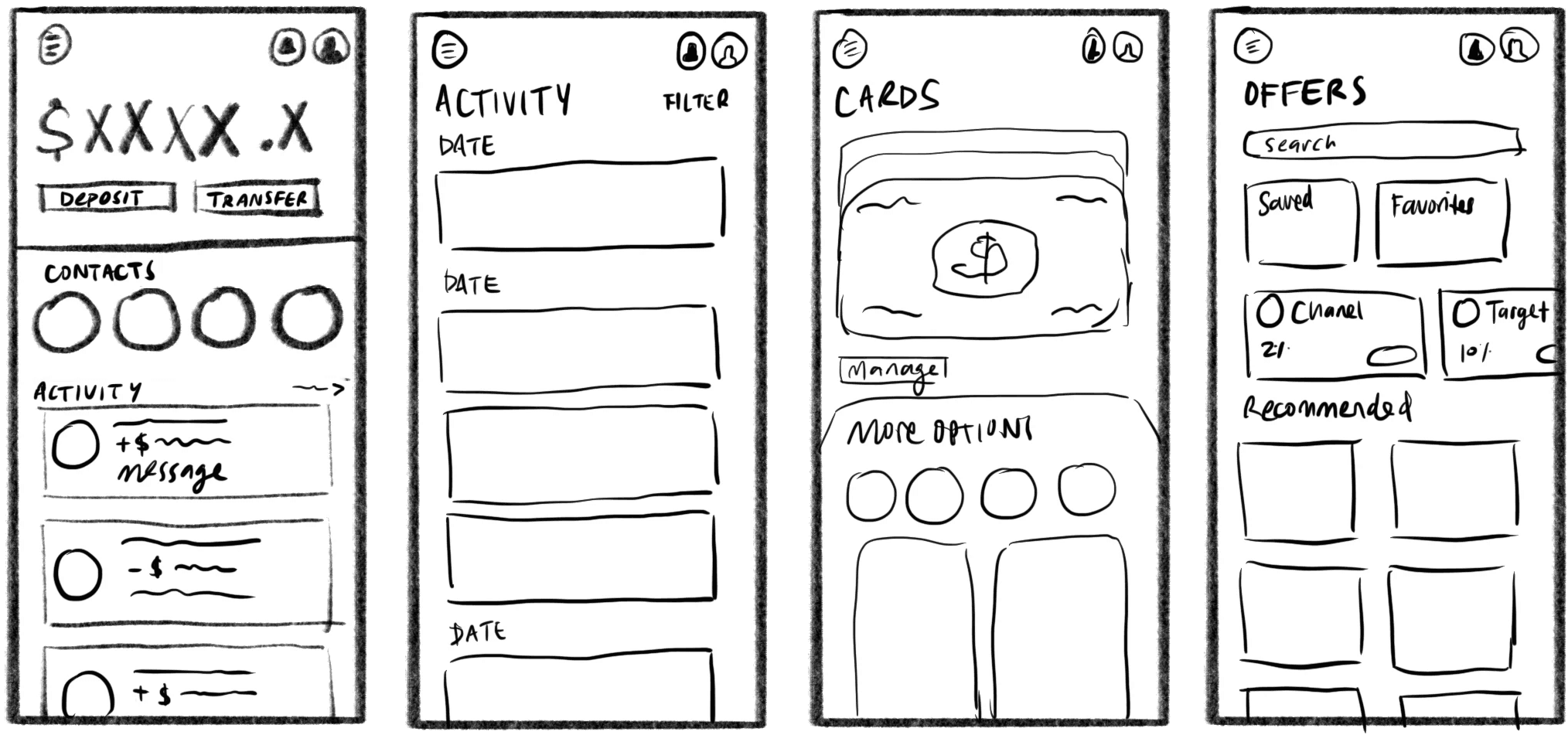
When brainstorming these designs, I took inspiration from a traditional wallet and the experience of pulling out cards. I also looked at how PayPal's competitors approached each feature uniquely.

Low Fidelity Designs

When brainstorming these designs, I took inspiration from a traditional wallet and the experience of pulling out cards. I also looked at how PayPal’s competitors approached each feature uniquely.

Final Prototype

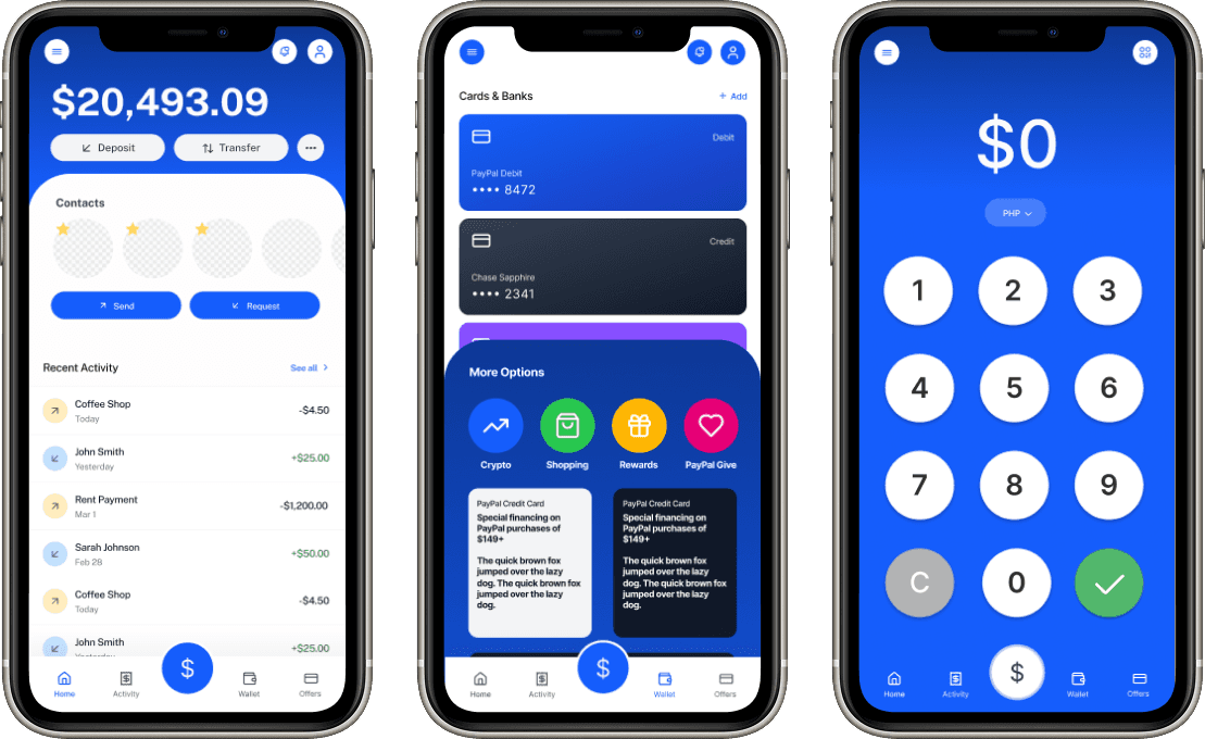
  • Kept all offers and promos in the offers tab -> more clean and streamlined.

  • Used a wallet-type animation for the cards -> feels fun and interactive while signaling the use of a wallet.

  • Put starred contacts conveniently under balance to promote core feature of sending/requesting money.

  • Kept a bright primary color palette -> associate PayPal with action and energy.
Reflection

This was my first foray into fintech and doing a whole app redesign. It taught me how to consider a brand's design and company principles when drafting up prototypes. I also gained experience with creating motion animations of the user flows. If I were to create my own brand, I would really lean into the social aspect of sending and receiving money, with emoticons, profile pictures, and reactions. I'd also try to make the stylistic theme more distinct. Overall, I learned a lot from this project and I'm grateful for the guidance from my RISD UI/UX class and Professor Lobbin Liu!

This was my first foray into fintech and redesigning an app. It taught me how to observe a brand’s design and company principles. If I were to create my own brand, I would really lean into the social aspect of sending and receiving money, with emoticons, profile pictures, and reactions. I’d also try to make the stylistic theme more distinct. Overall, I learned a lot from this project and I’m grateful for the guidance from my RISD UI/UX class and Professor Lobbin Liu!

Thanks for coming. Let's work together!

LinkedIn

Email